Guerrilla data architecture
How long have you worked in your current job?
How long have you worked for the same organisation?
How many of us can say we have a complete understanding of how the services, or the data from them, hang together?
It took me about two and half years working at the FSA to realise that I didn’t have a deep enough understanding.
It wasn’t particularly a problem, as I am sure it isn’t for most folks. You work on some services, try to make them better, and the data in them tidier and more available.
For the most part you make some progress, or learn a thing or two the hard way. But you never really get a grasp on the complete picture, because it’s often difficult to take what you learn working on specific services and use it to improve your view of the whole. You need a way to capture it.
One approach, which can often be seen in larger organisations, starts with cataloguing.
Data models, schema, data dictionaries - all useful artefacts. But this can be a labour intensive, sometimes terrifying, prospect.
It can require a significant commitment of time and effort to make enough of a dent in that backlog and see a return. This is what I would call a “bottom-up” approach.
But what if your organisation or team is small? What if you’re the only data architect, or there isn’t one at all?
You’re going to have to make some savvy moves, pick and choose your targets, because your resources are less abundant. It’s time for guerrilla data architecture.
Surveying the landscape
The bottom up approach attempts to understand the whole by absorbing, cataloguing, and recording it’s contents. This is a fine approach and will yield excellent results when seen through.
I am going to describe a simple step towards a top down approach. It is not as detailed, and will not conform legacy services as efficiently, but it can be done with a smaller commitment.
I first did this at the FSA because after a couple of years I had learned a significant amount about the organisation and it’s data, but still struggled at times to understand how it all fit together.
Get the crayons out
We are going to chart our data ecosystem. The advantage of this approach is that it is lightweight, and makes it easier to source contributions from across your organisation because it’s not overtly technical.
The disadvantage is that it’s lightweight, requires you to source contributions from across your organisation, and may lack technical detail. It’s all trade-offs eh? 🤷♂️
Let’s begin with basic situational awareness. What are the services, applications, and processes in my organisation that create, move, or transform data? From here we can continue to enrich the picture and work out what the most effective moves are.
This is the technique that I use. I’m not saying it’s correct or “good” but I have found it useful and had some nice feedback from people I respect so I am putting myself out there.
I have also been surprised that there are not lots of more mature examples of this out there. When looking at how things in your organisation connect, it seems that the most powerful thing you can do it just start recording it in some way. Perhaps institutionally we all have a bit of a blind spot where “the whole” is concerned?
This shouldn’t be confused with the excellent work done by The ODI on data ecosystem mapping. What we are doing here focuses on the mechanics and current state of the data ecosystem within the organisation. Their technique slants towards the value generated by the sharing of data across an ecosystem. It is an excellent piece of work though, and I would recommend that anyone with an interest in data reads it.
The conceit
For the sake of simplicity we will use an abstract example. We work for an up-and-coming firm in the hotly contested world of saffron cakes by post, “Saffron’s Coming Home” (sorry, I’ve been watching the Euro 96 repeats).
The business has risen organically, and is now a hodgepodge of off the shelf solutions, bespoke services, manual processes, and bun crumbs.
The team has changed around a bit over the years and grown with the business. This means that now, no one person has a clear understanding of how everything hangs together. Let’s try and correct that.
For this demo, and in my work, I use Kumu to create my maps. I started off with good old fashioned pen and paper, then I used MindMup for a bit as I started to add more detail and required more structure. I finally settled on Kumu because of it’s powerful customisation options, and the ease with which you can create something quite nice looking (don’t underestimate that when trying to sell this to others). I would however, recommend that when doing this for the first time, stick to pen and paper so you can focus on the content.
Level 1 – Understanding components
There are two distinct entity types in this method - users and services. The latter is further categorised to provide more detail but you can just leave everything as a service to start with.
I represent users as squares, and services as circles. You may choose alternative polygons if you so desire wild thing.
Users
What we mean by users is “any user or actor outside your organisation”. It is important not to include internal users within the map, as it will quickly become confused and unwieldy. Internal users are implicit, you can either work from the assumption that all internal users can access all the data, or you can add some detail to the services to cover distinct user groups. When starting off, I recommend the former.
Services
Services are a catch all term for services, applications, processes, reports, or any other designation you can dream up. When I do this, I make each one of those a distinct type, so that Kumu colours it accordingly, and you can get a bit more information at a glance - but it is not a necessity. You will likely find that once you have assembled your first map, you will want to go back and add this additional detail on your second pass.
Our first node
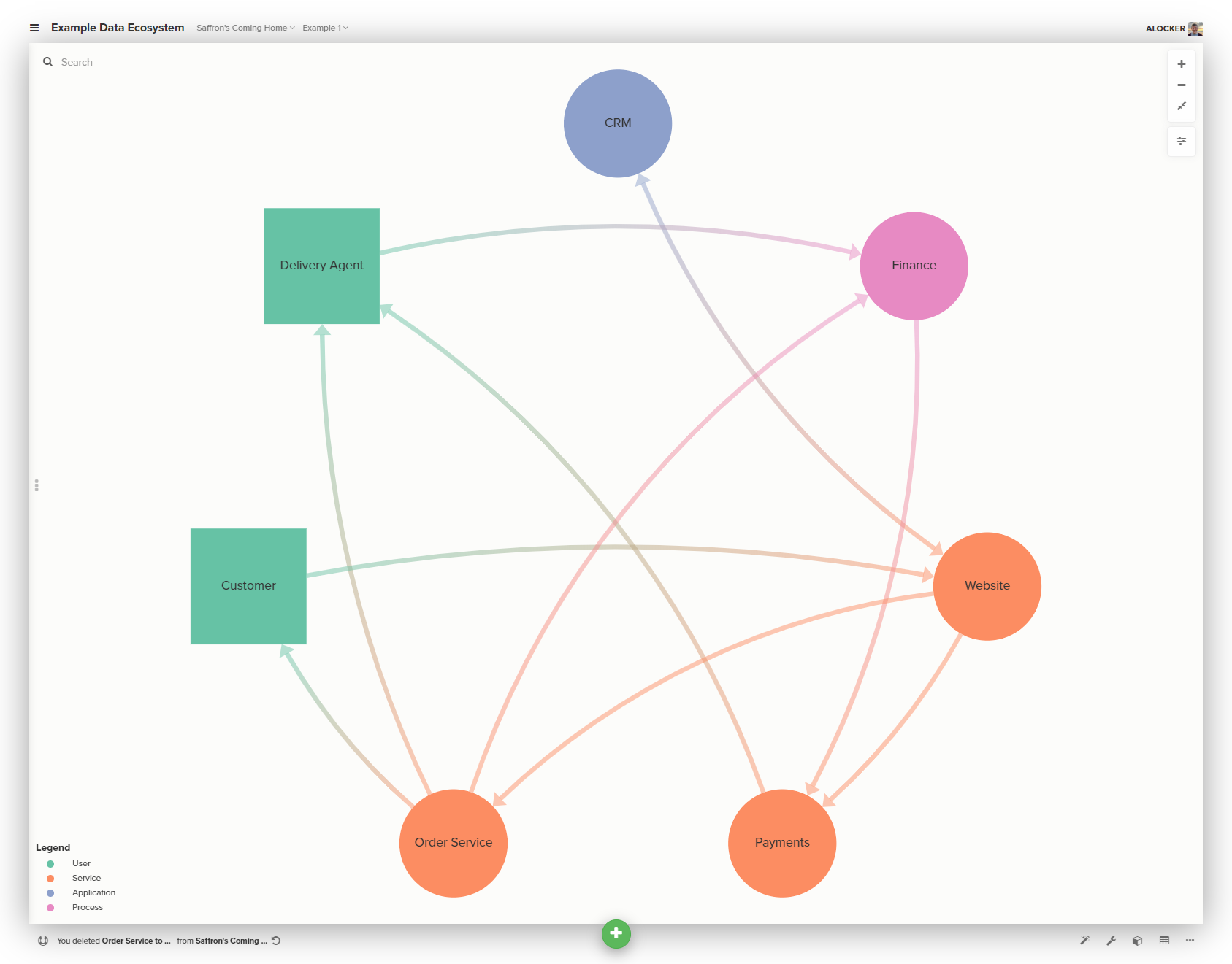
Let’s start with the most obvious user, our beloved customers.
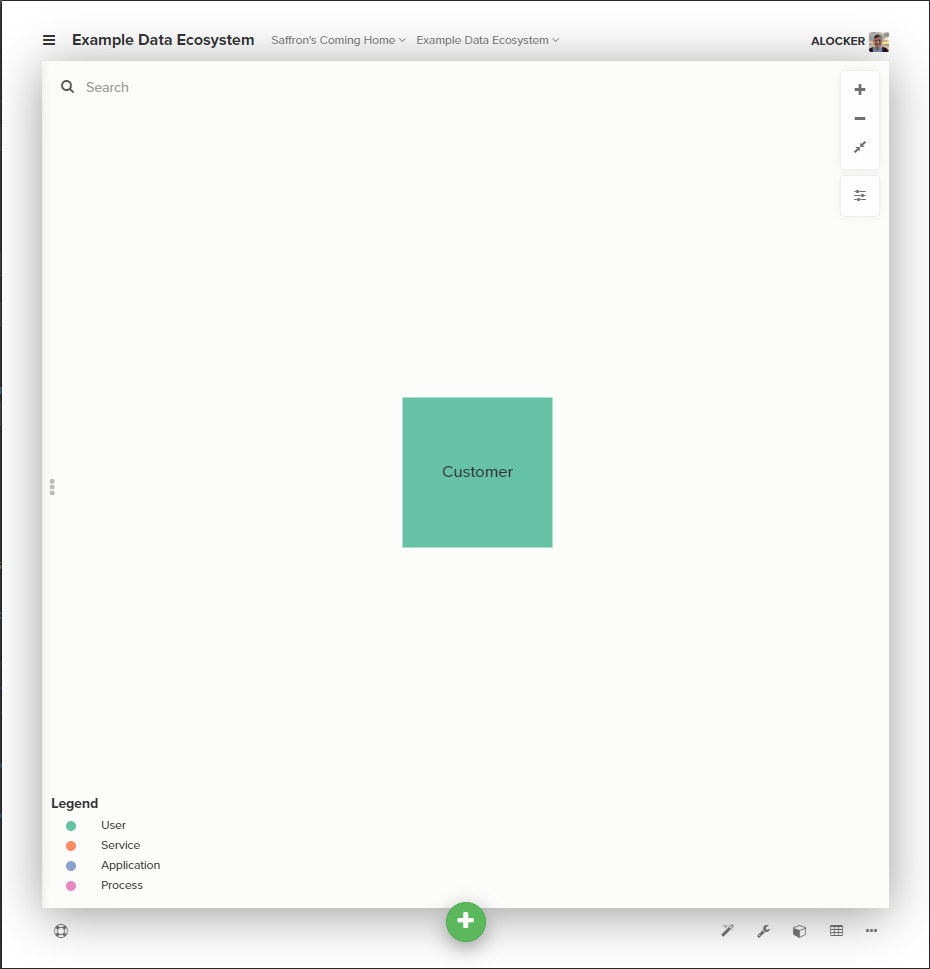
Customers make their orders through our website, which generates and hands-off data to other services.
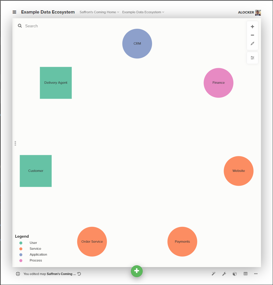
We use an off the shelf CRM application, a bespoke service to send orders to the bakery, and a third-party service to handle payments.
We’ll add a second user in the shape of our delivery partner, and our finance team use an excel based invoicing system (the stick in the muds).
That’s plenty enough complexity for this example, and adding all those nodes gives us this.
This step will take more time and effort than you expect. The best way to populate this map means talking to people in the business. If you are a new data architect to an organisation you will stand no chance without talking to folk. If you’re an established one you’ll stand no chance either, but that’s another blog post entirely.
Those that have been there longest will be able to help you fill out the bulk of it fastest, but the real gems will turn up when you speak to specialists who only work with one or two services but know them inside-out.
Level 2 – Join the dots
Now we have the components, we need to show how they connect. I currently use two different types of connectors - data flows and relationships.
Data flows
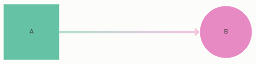
Data flows are the most common connection. They represent any kind of data transfer between two nodes.
Users may provide data to, or receive it from a service. Services provision data to other services and applications.
Data flows are arrows, they can be unidirectional or bidirectional.
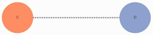
Relationships
I originally started adding relationships once I had completed my initial map and needed an easy way to represent that two services held data so similar as to be related, but there was no mechanical passing of data from one to the other. These quite often show easy wins for automation or removal, but not always, use them with caution and only when you are sure the data is close enough to be considered related.
Relationships are represented by a dotted line in my maps, but you could use a different colour, some cool tape or a glitter pen if you’re fancy.
With that in mind, lets add connections for Saffron’s Coming Home. I’ll list them here and add them all to stop this already long post getting wildly out of hand.
- Customers provide data through the website
- The website passes data to the CRM application, the payment service, and the order service
- The order service provides data to the delivery agent and the finance system
- The finance system provides data to the payment service
- The payment service provides data to the delivery agent (when their invoices are paid)
- The CRM only communicates with the website to handle customer accounts
From speaking to colleagues as well assemble the map, we discover that finance currently rely on the data from the order service to do the books, and that their only interaction with the payments service is to make payments to our delivery partner.
The users tell us that they know the data in the two components are related but because of this they are struggling to reconcile some of our credit card charges. This seems like a fine place to add a relationship.

Level 3 – Understand and define conceptual entities
Okay, so we have a nice looking graph and perhaps learned a few things along the way about how things really connect to one another, but how do we make this useful in guiding where to focus our effort?
This top down approach requires us to be more selective in what we do, so we need a little more data to guide us. We need to understand the conceptual entities that exist in our business as they manifest themselves in services.
Whilst I have laid this out as a step-by-step approach, you should be doing this step along with step 1, when you’re talking to people in the business. A common vocabulary, that sometimes contradicts itself will begin to emerge. Don’t worry, these contradictions are useful.
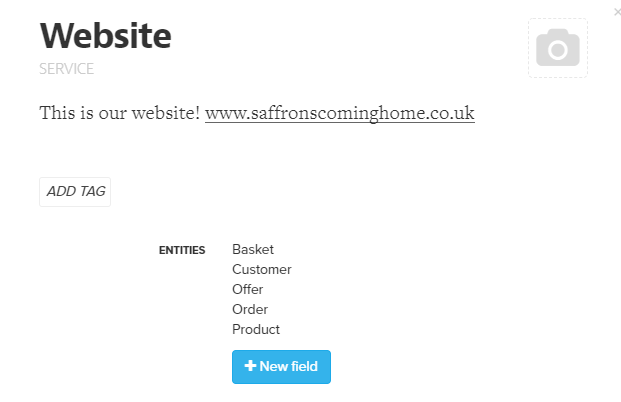
For each service I go through and simply list all the entities we find there. Some of them are fundamental, some of them are on the periphery, but like Pokémon, you gotta catch ‘em all.
Let’s add some detail to our website, the key entities that we find represented in the data there are show below.
As you begin to do this you will notice a couple of key things:
- entities will appear in multiple services, especially those that connect (I appreciate this is blindingly obvious)
- the older and more complex the ecosystem, the higher the likelihood that they have different names across services and you will need to do further research to establish whether they are the same, or just similar
I believe this step is the lowest effort activity that sets you on a path towards a long term data architecture and the improvements that can bring.
The longer and harder work is to define those entities. To catalogue them. To disambiguate them from other entities. To design them so that they meet the needs of your organisation now, and into the future. I spoke about this in another blog post.
Level 4 – Enrich the map
The map should be a living document, and it should be widely circulated. It should be open to being shared, criticised and outright nicked by others in your organisation to do with what they will.
You should do this not entirely unselfishly. By this point you should be showing your map to anyone who will listen. Those that are into it will show themselves immediately and should be cherished.
They’re the ones who’ll ask you all sorts of questions, most of which you’ll be unable to answer at this point. Things like;
- Where do you think we can make the biggest improvements?
- What can we get rid of?
- Why does that go over there, then back there, and then back around to that other bit I’ve never heard of?
- What exactly is that thing I keep seeing in all the systems, why don’t I know it as that?
In any reasonably sized organisation you will need help to make the map useful. These questions will let you know what to ask next.
In our example, let’s say there’s currently some problem with our poor beleaguered finance team and the reconciling of payments.
Perhaps we find out that is because they are being inundated with data from our payment provider, that includes a whole bunch of information they don’t actually need. Now they’re doing a combination of manual cleaning and nightmarish workbook scripting to just get through it all.
Let’s add an approximation of data volumes to our map. I do this by rating all the connections on a 1-5 scale and a a bit of formatting in Kumu, but you could just as easily write it down.
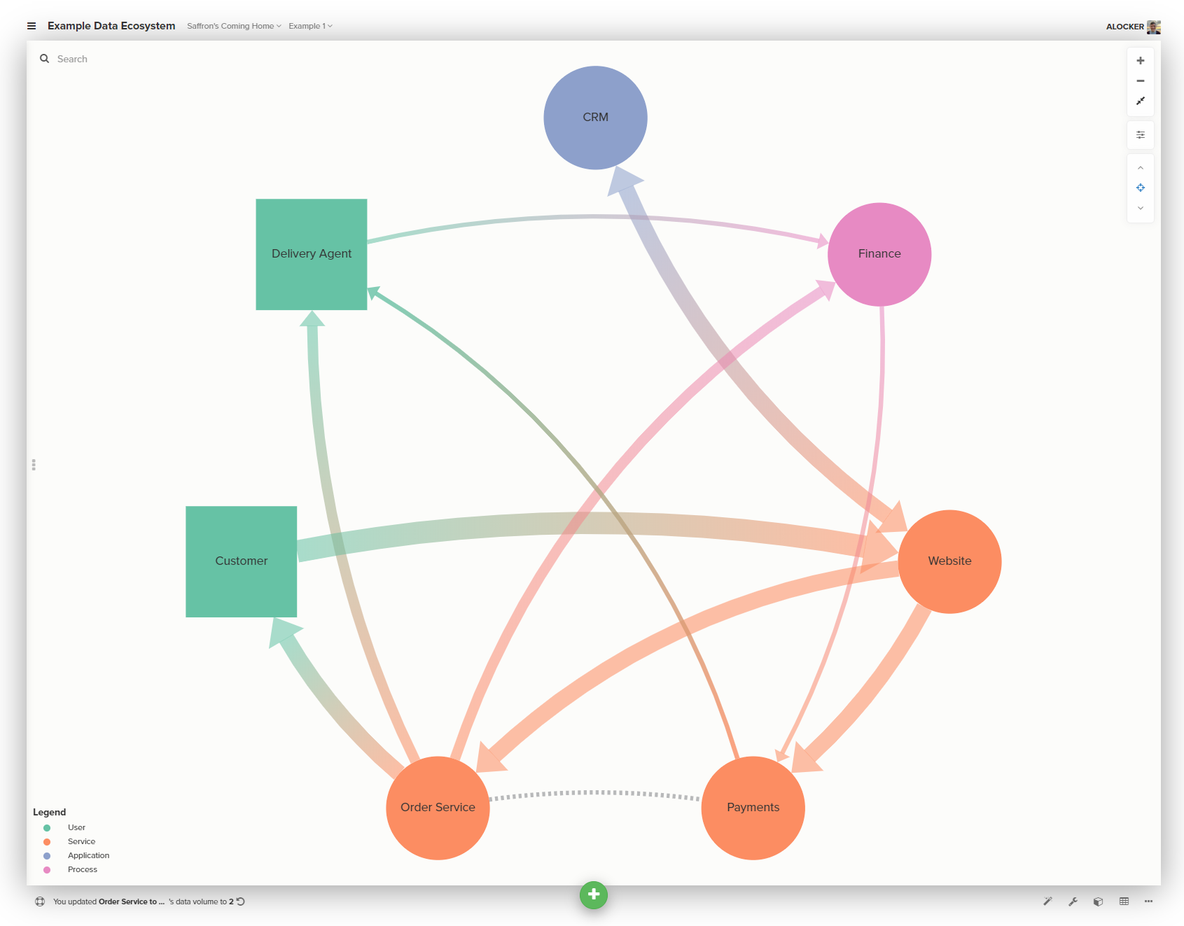
The problems with the payments data are now writ large for all to see. Showing beats telling every time.
Some other properties we have added to our maps that we’ve found useful include;
- Data transfer frequency, some stuff is real-time, but you’d be surprised what only moves monthly at best
- Data transfer mechanics - is there an API? Is it a spreadsheet or report? A combination of things?
- Who owns the thing? Service and product ownership aren’t as mature or obvious in many organisations as it is in our little digital bubble, knowing who to know is very useful
- Also known as - this one felt a little silly at the time, but once you get several acronyms deep it’s really important to be explicit about services in the map but have somewhere to refer to what others know it as. Especially if two different groups call it something different
- Reference data - list what is or could be reference data. There is still an enormous amount of gains to be made across swathes of sectors by people creating and publishing reliable, good quality reference data, and not just government
This is just the stuff around data. It can be incredibly useful to enrich the picture with information from technical architects, commercial teams, security and information governance, and let’s not forget users. I could think of far worse things than to get a rating on how much they like or dislike a service using a sliding emoji scale…
😀 🙂 😑 😒 🤬
Level 5 – Look outside
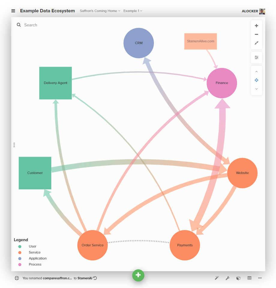
Once you have a better understanding of how things fit together in your world, you can start to look for opportunities outside it.
Start by adding those services you use but don’t own, and then think adding data sources you don’t own or use. By adding prospective useful data sources to your map, you make it easier to see what the biggest opportunities lie.
We include outside data to our map by using a rectangle. For our example, let’s say that a clever clogs in the finance department has discovered that there is a new comparison site to get the best price on saffron, StamenAlive.com. Let’s add it in.
Hopefully, we now have a working, useful artefact for the team at SaffronsComingHome to understand how their services, and the data they produce fit together.
They can make decisions from a more informed position, and new team members can get a head-start on understanding without having to tour the whole business first.
As I said before, I originally did this just to address my own blind spots. I also promised a few people at Open Data Camp back in November that I would write about it - so here it is.
There’s no great trick or sophisticated techniques here, just a simple method to organise some of the knowledge scattered about an organisation and provide a clearer picture. I hope you find something useful here.
Cheers ‘n’ gone.